The Market Puzzle, Keying Off the Pivot Point
January 25, 2018 was the S&P Stock Market High.
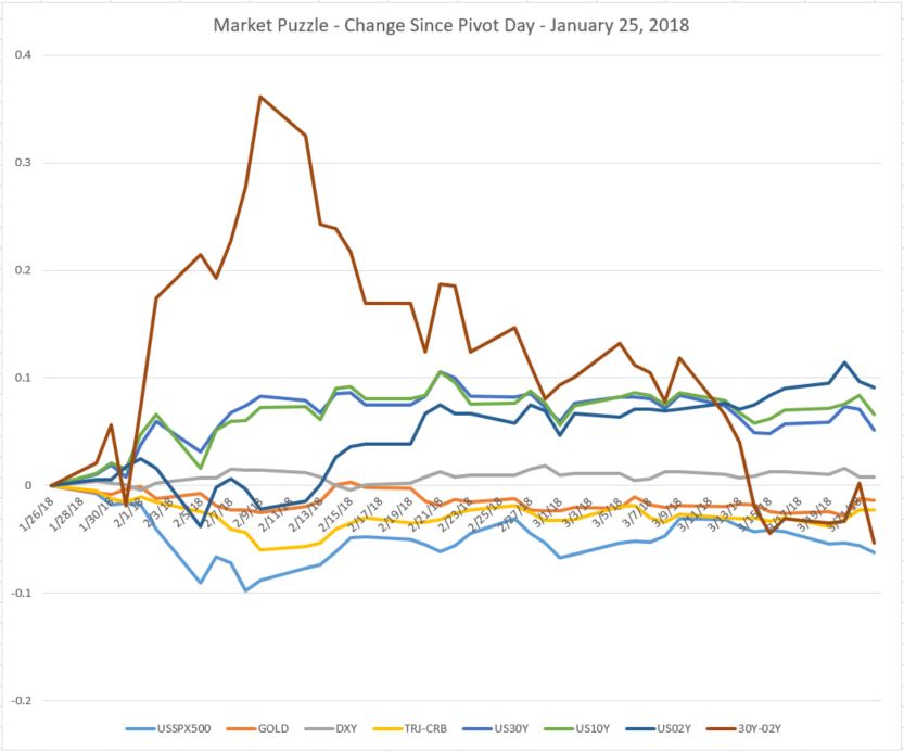
We call this the Pivot Day. Since that high we have been watching the stock market puzzle unfold, the initial decline, the bounce rally, the indecision volatility, and now over the next two days, the anticipated market breakaway to the downside.
The chart here is part of our analytics that we developed and use inhouse. The lines on this chart are calculated percent change from the Pivot Day. These lines are key factors in the puzzle.
For us the Macro Market important line is the 30 vs 2 year yield curve rate of change, the brown line. It rose quickly as the stock market had its first crash into February 6, 2018, then the rate of change declined and went negative on March 14, 2018. This chart is updated through today’s opening and one really interesting quirk is that after the FED meeting yesterday, the line had a quick uptick to positive and then gave it all back in todays early market. Other lines that are showing negative change are stocks, gold, CRB commodities. The three lines showing positive change are the interest rate lines, to be expected here in the early phase of the Macro Move.
This is not about Facebook. There is always the needle that pricks the balloon.
Leave a Reply