Macro Picture Updated…
Below is an updated chart throughTuesday night. It is a Macro Economy Valuation using an algo with market data inputs for stocks, bonds, commodities, gold, bonds, and the 30-05 YC. Detail here:
SPX, NDQ, RUT, CRB, DXY, GLD, US02Y, US30-US05 YC.
We first showed this chart in our Feb 22 post. Recent points are, a low Apr 2018, upturn Jan 2019, High Aug 2020, downturn Sep 2021, stimulus blowoff Mar 2020-Jan 2022.
The version here explodes the range to include all data since March of 1988, 35 years. It can be noted that each wave tends to find support a bit above the top of each previous bottom area.
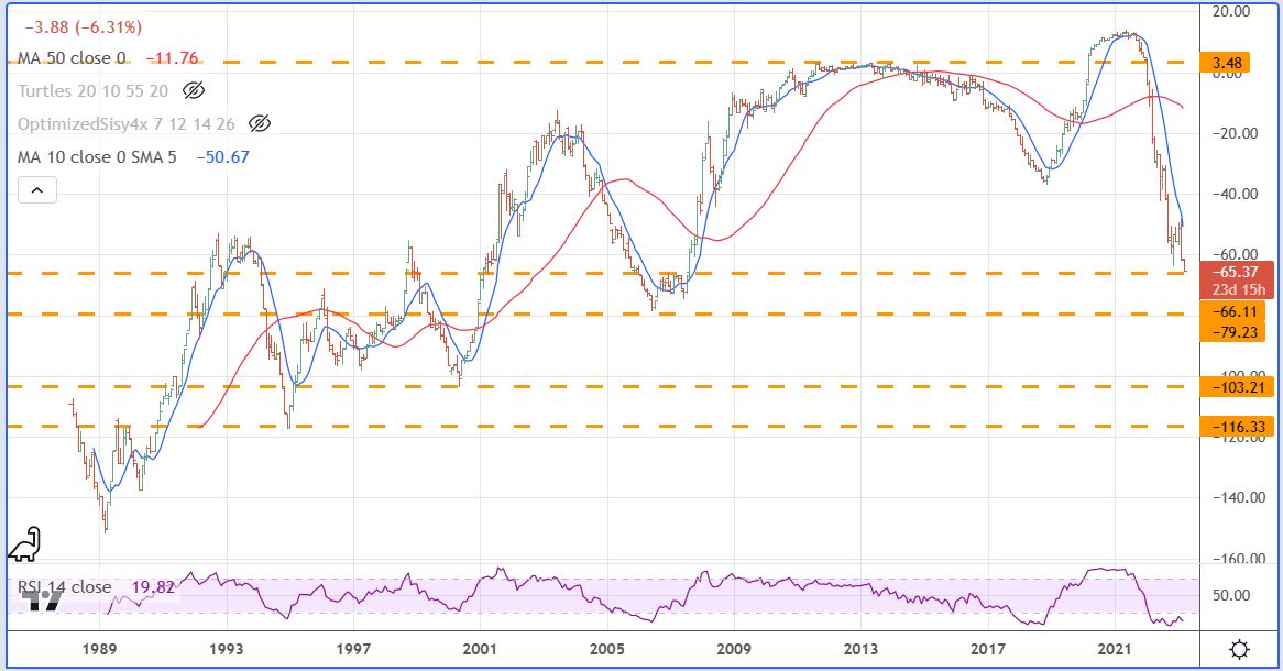
For me the important point is that when one takes everything into account, not just stocks, but marked to market prices for all the pieces of the economy, the big crash that many are predicting has already happened.
Leave a Reply