Look Deeper, the Greenspan Legacy
The markets have had a bit of a dip since the beginning of the year but there has been little panic. That is to be expected after two generations of traders have learned that the FED will always step in if things approach free-market status. Maybe it is time to look deeper.
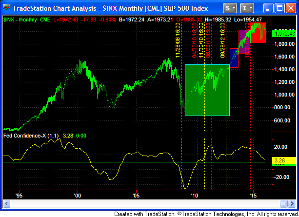
We are attaching a chart that we call Fed Confidence that we devised many years ago as it became apparent that the FED was the elephant in the room. We will then indicate time points that appear to be relevant in a deeper look at the markets.
This chart spans the period that the FED has actively tried to manage the market starting in 1994 with Alan Greenspan’s efforts. The areas to key on in this chart are when the Fed Confidence line crosses under or over 0.0. For the data period shown here, the first time the 0.0 line was breached was in February 2001, second was November 2003, third was April 2008, and the last was April 2010 just as QE1 ended. Since then the line has cycled above 0.0 and last peaked in February 2014. We will talk more about this chart tomorrow, but don’t look for real panic until the line in breached to the downside.
Keep in mind this chart is a Macro chart using monthly data. Time lines are for the various FED action points for the various QE’s. Yellow time lines are start points, red lines are end points. Also you will see coloring of various types of market action, blue is breakout, purple is running, red is topping.
Leave a Reply