2023 Forecast
January 3, 2023
First, as the politicians always say, to be perfectly clear, da, da, da.
For me, to be perfectly clear, no one knows what is going to happen in the coming year, but what one can do is set benchmarks that allow one to judge course corrections as the year unfolds. In 2023 we will try to check progress against the benchmarks and make adjustments on a monthly basis.
This is the second draft, cleaned up some details, added a table and added a little trading talk at the end.
General comments…
- First, interest rates. As long time readers can attest to, I have been a proponent of a stable 3.5 % rate for many years, during the years when the rate was zero and recently as the rates are above 3.5 %. History tells us that interest rates are not so much about economic activity and the demand for money, but more about a government trying to send a message to the people. For thousands of years 3.0 to 3.5 % rate has prevailed with a general range of 2 to 10 %. However in recent history we have seen our FED go outside the bounds with a range of 0 % to 20 %. We might ask why they have created so much economic instability and the easy answer would be too many college educated PHD economists who put free markets on the back burner and want to create an artificial legacy for themselves. We will look into the current interest rate picture.
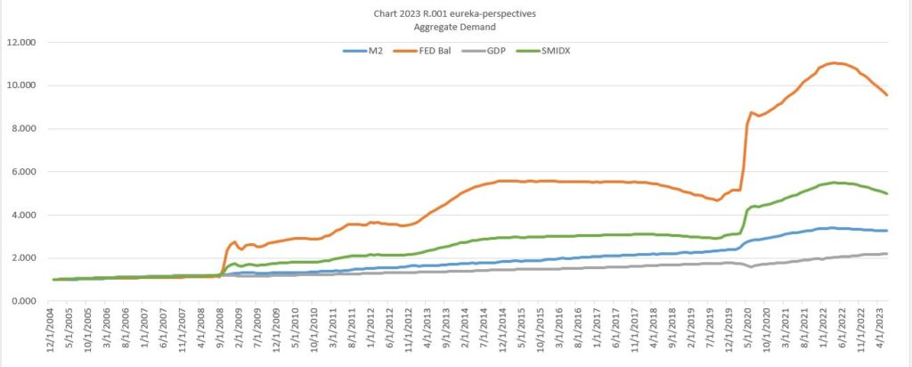
- Second, demand streams for assets. These days that demand seems to be dominated by two streams controlled by the FED, M2 money supply and the FED Balance Sheet, and one controlled by the people and markets, GDP. In this piece we will look at how these numbers look currently and what could transpire during the coming year.
- Third, inflation factors. Depending on who you are listening to, one gets a different story on the basic causes of current inflation. The Fed says the problem is wage inflation, Powell recently pointed out that 55 % of the inflation problem can be tied to wages, while some private economists say that supply chains issues can be viewed as the cause of 40 % of the problem, and various politicians say that corporate profit gouging is the biggest problem which must mean more than 50 %. So adding all these together we come to maybe 150 % of the cause, while still leaving out a lot of other reasons.
Interest Rate Analysis
To start the analysis stage I will first make some observations on the interest rate situation. My belief remains that inflation numbers will decline faster than the FED currently believes, one because we are in the base of an economic wave, a comment that will be backed up later in this piece.
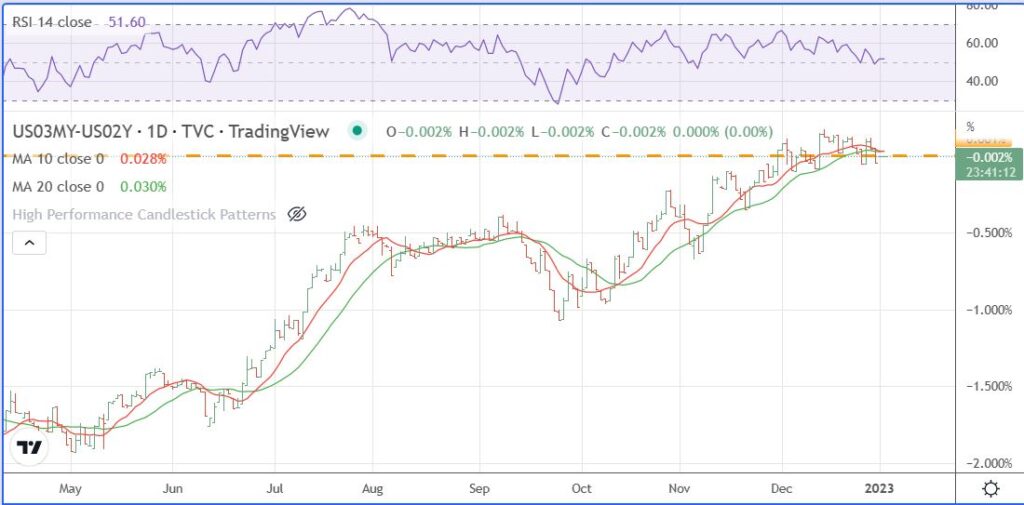
Here are some charts that I follow to maintain perspective. First, we have the chart of the 3 month FED funds rate vs the 2 year market rate. To me it appears the 3 month rate is having difficulty in moving the 2 year market rate higher.
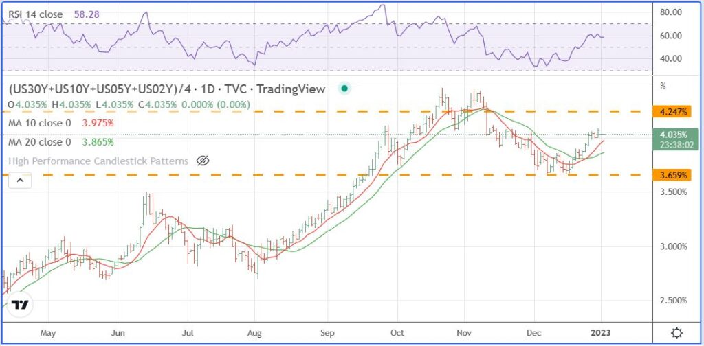
Nest we have the composite chart of the interest rate market where the average of the four measures is shown, the 30 YR, 10YR, 5 YR, & 2 YR. It provides a broad view of rates. Two gold lines around the current congestion area are at the October 13 HI of 4.247 and Dec 13 LO of 3.643 and the high on November 4.
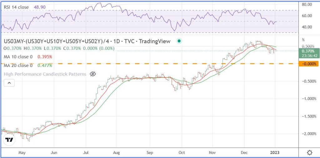
The next chart shows the differential between the 3 month FED rate and the composite market rate value. The yellow line is what I am watching, when the FED funds rate gives up on trying to push market rates higher.
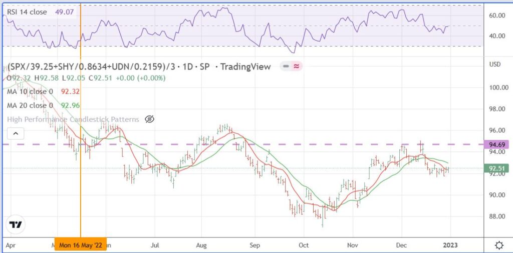
The next chart ties together three elements of the Macro market, the S&P, the 2 Yr bond, and an inverse dollar, all values normalized for the comparison. The yellow vertical line is at the start of the Macro market bottom on May 16, 2022 and the dotted horizontal line is an important gauge to show when the general economic environment is improving.
The Economic Picture analysis is coming next. The methodology and numbers are what I referred to at the beginning as important benchmarks influencing market movement over the coming year,
While I don’t include the dollar in this methodology, I will say my background view is that I would not be surprised to see the dollar decline to the 97 area sometime in the coming year, not a big decline but a view that the top is in play.
The Methodology for the Forecast…
- First I estimate aggregate demand availability based around three values, a) GDP, b) M2 money supply, and c) the FED balance sheet. In the first six months of 2023, I use GDP of + 2 % ( a modest uptick following surprising 4th qtr estimates), M2 money supply – 1.6 % (continuing a decline), and FED balance sheet down 8.8 % (continuing the unwind).
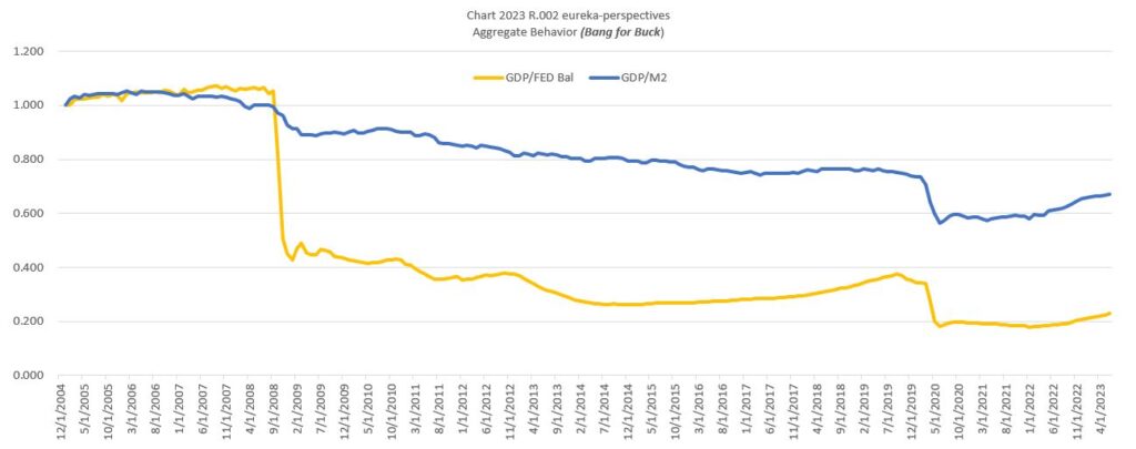
For me the next chart is a picture of the efficiency of the economy to use its aggregate sources of growth. We can see that until recently, after peaking in the 2008 area, all the cheap money decreased efficiency. A trend change to growth finally started within the year, between February and October. That was probably due to less money being pushed into un-productive uses as interest rates rose.
2. Next for each sector, the S&P SPX, The NASDAQ NDQ, Bonds TLT ETF, Commodities CRB Index, and Gold GLD ETF, I apply a multiplier based on the history and trend of the multiplier. The next chart shows the history of the multiplier for each sector. For the 2023 estimates included in this table I primarily used recent trend for the forecasts.
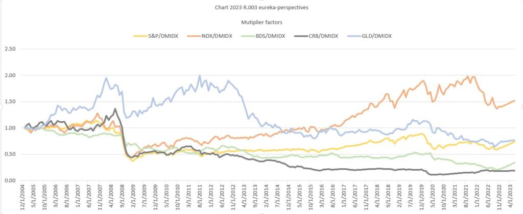
The pattern of the multiplier is rather interesting. Here are some comments for each sector based on the data we using starting in 2005 when the housing leadup into the 2008 economic peak occurred. Here are the dates for the all time and recent highs and lows on the multiplier for each sector
High Low Recent HI Recent LO
S&P May 2007 Feb 2009 Dec 2019 Oct 2022
NDQ Sep 2021 Feb 2009 Sep 2021 Oct 2022
TLT Jun 2005 Oct 2022 None Oct 2022
CRB Jun 2008 May 2020 None May 2020
GLD Aug 2011 Sep 2022 None Sep 2022
A few things jump out to me when viewing the multipliers.
- All the talk in 2021 about the huge runup in stocks being about growth was pure bullshit.
- The current commodity inflation is really nothing compared to 2008. It could well be that Powell was correct, that inflation was transitory, he just didn’t have the patience to gut it out. I again will say, the current inflation has a high chance of dissipating fast, because it has no deep supply basis.
- For me the forecast for bonds that came out of this model surprised me., but I made a pledge to myself not to tinker with the results until I see more data stream out.
- Obviously the most important factor in the whole equation is getting the multiplier right.
Next some charts, the bottom line, the charts that show the price history including current six months projections of our model.
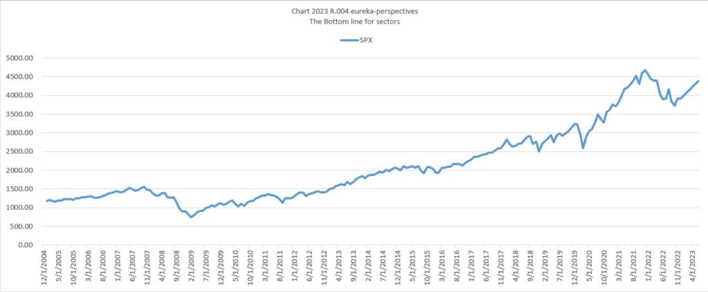
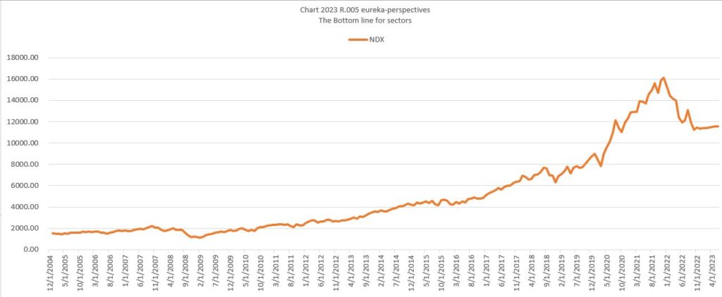
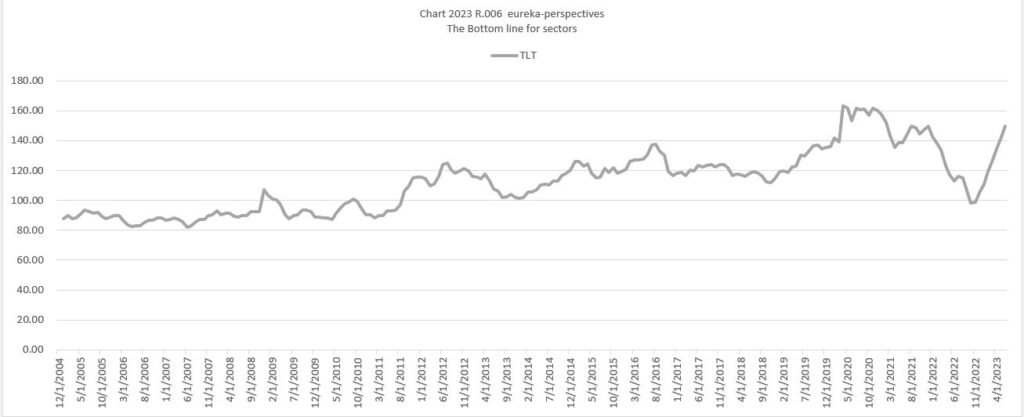
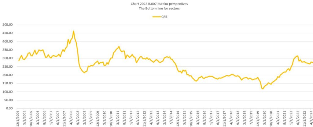
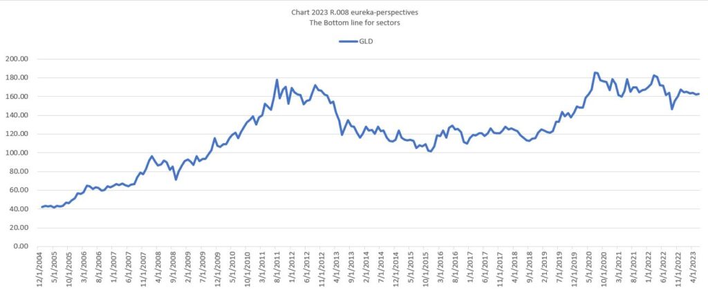
Table of Values..
Here is the table of values for 2022, plus first half 2023 forecasts.
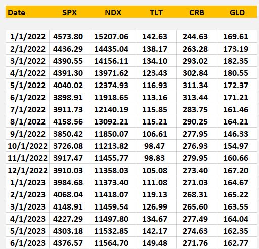
That’s all for now, the model is excited about bonds, and a little bit of strength in the S&P and NDQ, kind of sideways on CRB and Gold. Keep in mind this is a Macro analysis, and it may take some time some time to evolve, days, weeks, as the FED still has its finger on the markets. We are not even close to having free markets.
Trading all this in realtime.
Watching market interest rates, ie. the composite average of the (30 yr+10yr+5yr+2yr) is key. Both the direction of this average and its value, especially when the 7 day average is below 3.6 % is a second factor. Also I am watching the 3X bond ETF TMF and its technical direction.
Leave a Reply