Big Picture Detail
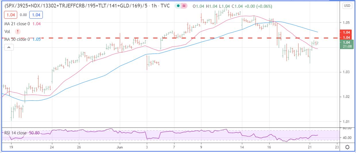
Here is the chart I look at whenever craziness is rampant. So we had a market decline last week, and now we see all the CNBC pundits saying this was just a pause before new highs. Is it really a pause, I doubt it, too many important relationships unraveled after June 10.
This chart uses hourly data to drill down into the Big Picture. It is an unweighted composite of SPX, NDX, TLT, CRB, & GLD. A broad view of stocks, bonds, commodities, and gold. The market appears to really have rolled over, and I doubt if Powell’s testimony to Congress tomorrow will change anything.
Reopening Fundamentals
While CEO’s are trying to spin a “Going Back to Normal Story”, we took a little road trip through parts of Illinois, Indiana, and Michigan this past week. Things are anything but back to normal in the towns and rural areas, restaurants are desolate places these days, and while masks are rarely seen, people are wary and maintaining distance. Things are not happy out there, probably because the people do not trust each other, and for good reason, at least a third have their head up their asses.
Leave a Reply