Pushing the Limits
This feels like the week that I have been waiting to happen for nine years. What I mean is that since the start of Bernanke’s QE2 Funny Money saga what I have wanted to see is a time where everybody, especially the CNBC and Twitter Guru’s crowd, is on the same side of the boat. It appears we are there.
We have been posting our Fed Influence chart since August 7th when it peaked. Since then two sectors in that equation, gold and bonds, have had big declines and the extent of those declines are pushing their decline limits until the other two sectors in the equation, stocks and commodities have their decline. Now those two sectors should start to feel the pressure.
Fed Influence Master Chart
Here is our Historical Fed Influence Master Chart which goes back to 2005, the period leading up to the 2007-2008 economic peak. What we try to measure with this chart is the differential between Fed Actions and GDP. The goal is to monitor the response and see whether the Fed is promoting growth or speculation.
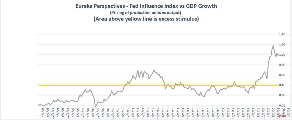
What you see here is that between October 2010 and June 2013, we saw the first wave of GDP lagging FED inputs, and then June 2019 to present when GDP is massively lagging FED input. In those periods of lagging growth response, the money moves into speculation which now is at record levels.
Reading into this further, the current talk of Global Reflation and massive dollar decline is nothing more than hope and Happy talk.
Here is the updated short term FED Influence chart that we use for timing purposes and post often.
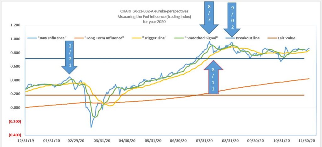
The chart illustrates the long tail to the right of the August 7th peak.
Leave a Reply