Getting Perspective…
Now that the early 2024 staging is set, it might be time to step back and look at the Big Picture as expressed in market prices up dated this morning, January 12, 2024.
As I have done occasionally in the past, I am sharing here today three charts that provide a quick comprehensive look at market forces.
These are charts going back to 2005, prior to the housing crisis, that I have used over the years.
They are titled:
- Economic Headwind Pricing (expressed as a negative number)
- Raw Market Demand Pricing
- Net Market Pricing
The Economic Headwind Pricing is made up of four general categories:
A) Interest rate average of ( 30 year to 3 mo range of rates, the higher it is the more negative on the market)
B) 30 to 05 Year yield curve. (the lower it is the more negative effect on the market)
C) Gold Prices (the higher it is, the more negative it is for the market)
D) Dollar (the higher it is the more negative on the market)
Here are the three charts:
- 1. The First Chart, Economic Headwind Pricing
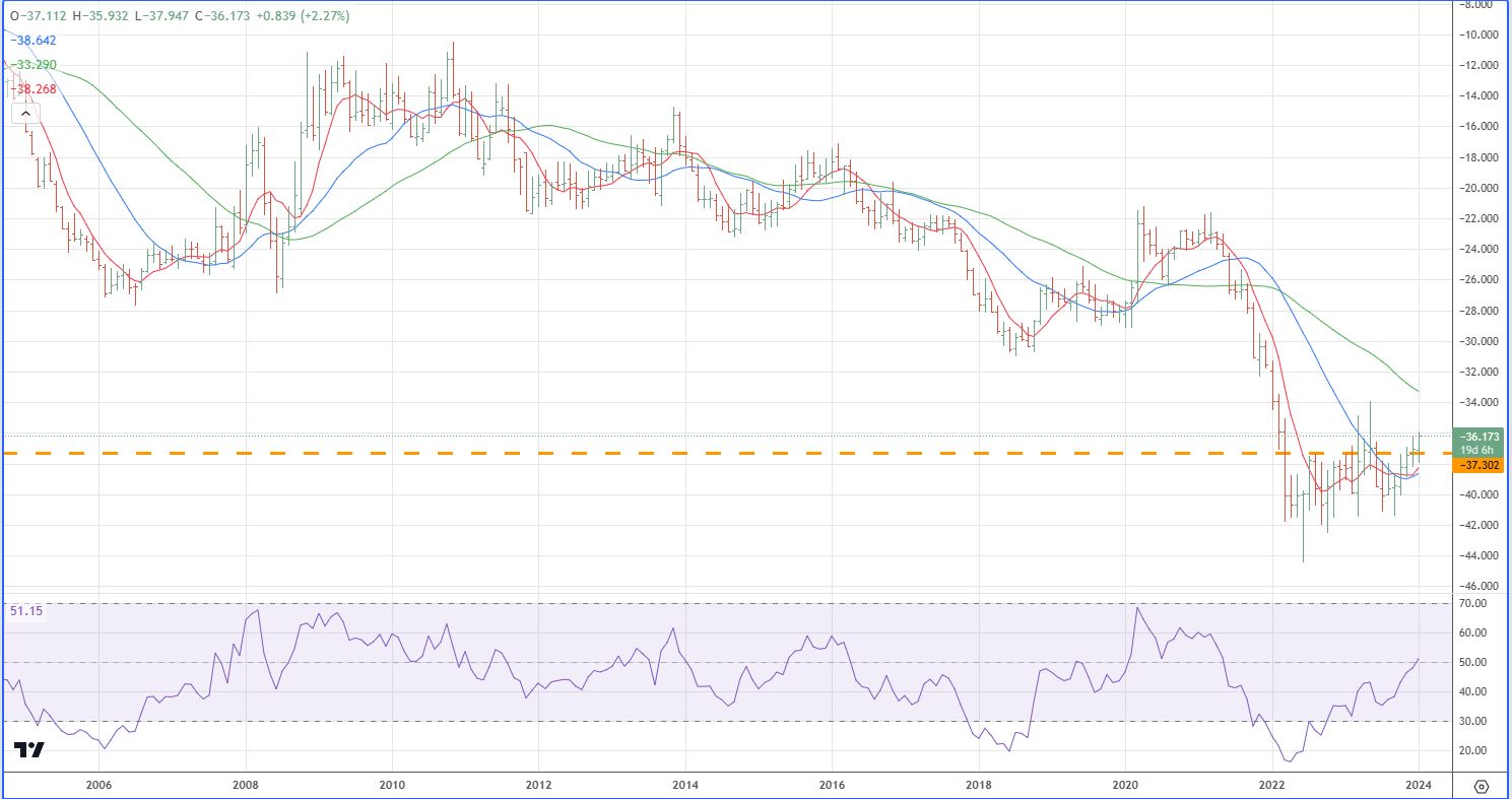
In analyzing this chart it is obvious that the lowest headwind (lowest negative number) occurred in November 2010 just as the Funny Money forces were building. Since then the Headwinds have been building (larger negative numbers) reaching the lowest negative number in June of 2022. Since then a slow decline in the negative number regime has been seen with current levels trying to breakout above the May 2021 exuberance level (when market players got a bit ahead of themselves on FED actions). The important point, market headwinds have been such that inflation forces are not anywhere in the scene, nothing like what we saw in 2010-2011 when the FED was attempting to push the economy higher. The 2020-2021 inflation blimp was purely a dislocated supply situation.
- 2. The Second Chart Raw Market Demand Pricing
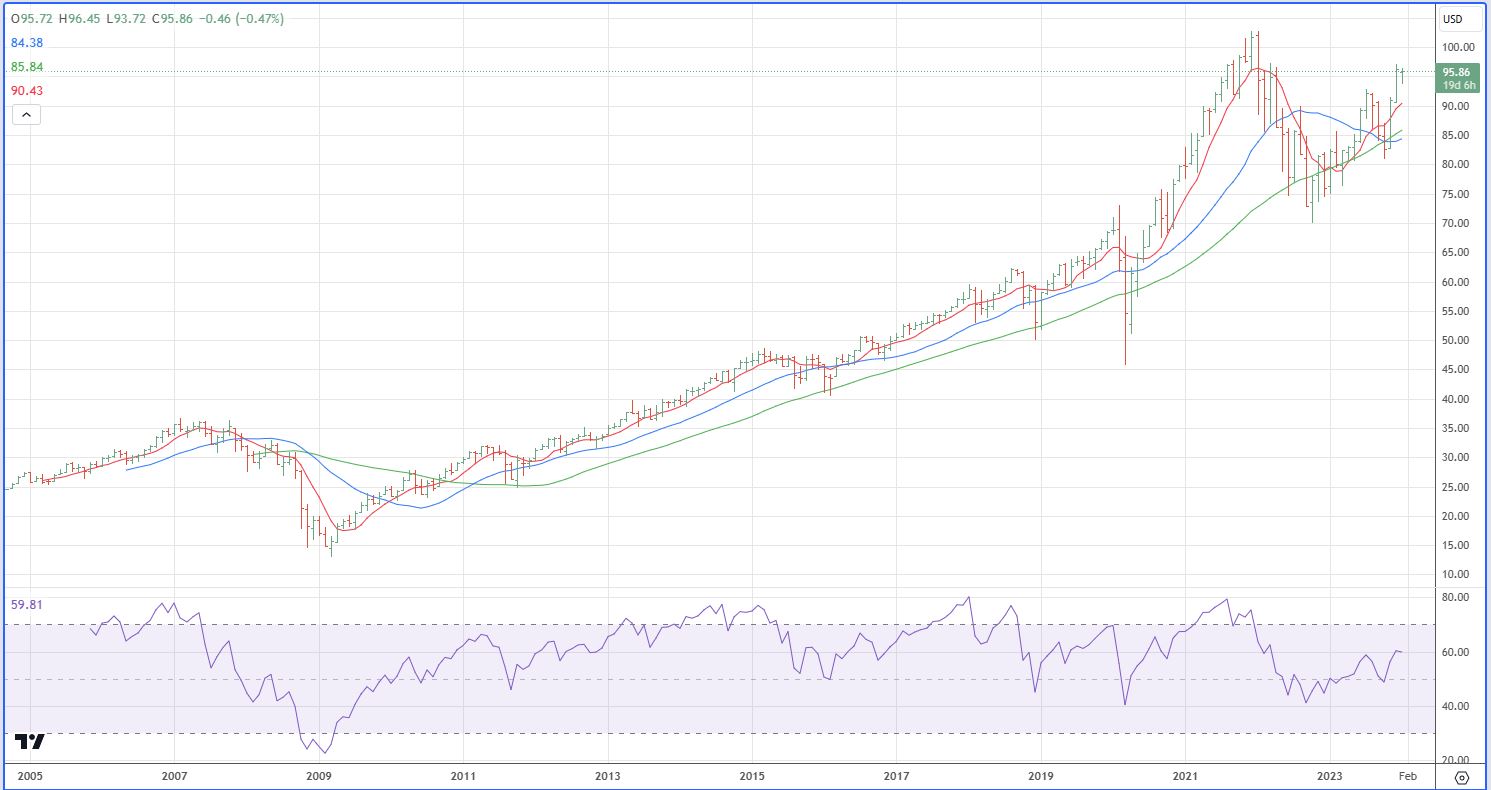
This chart involves a summation index of S&P, Nasdaq 100, Russell 2000, plus Real State ETF pricing. 2009, 2020, and 2022 saw some declines but the overall drift has been higher. At the moment we are seeing a rebound to around August 2021 levels with January 2022 levels still holding as the highs. Challenging these top levels looks to occur in March 2024 with an outright breakout probably in late summer as election direction starts solidifying.
- 3. The Third Chart, Net Market Pricing
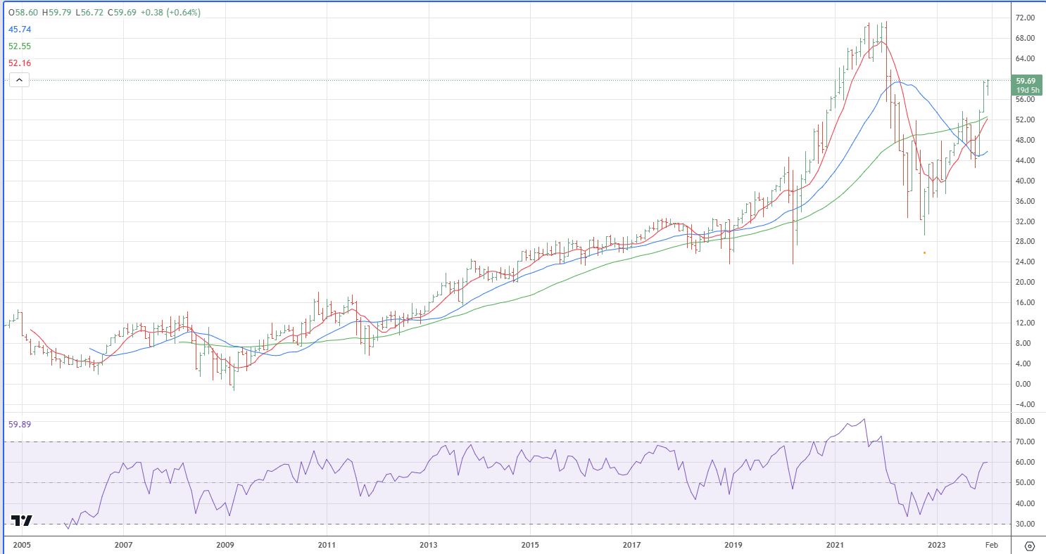
This chart is the net result of the prior two charts. It shows the huge effect that the economic headwinds are placing on the markets. I don’t expect this chart to make new highs until early 2025 after the election results solidify.
Leave a Reply