Coming out of the Turmoil…
Here we are on Thursday morning October 5th, after a week of chaotic behavior.
The Bears have been out in force during this period, for the lack of a better name let’s just call them the Jamie Dimon/Bill Ackman “Sky is Falling Group”. They have a number of good macro points, but one would have to say these macro points have existed for over 40 years. This group has missed the early part of the “Green” rally, the rally that started in June of 2022 and still is not recognized for what it is.
Most of the down playing of this rally is probably due to the fact that the Biden Administration has done a poor job of outlining the parameters and scope of the “Climate Change War”. Biden has not appointed a head dog in the fight, someone that has the expertise and in-your-face personality that the country can not forget. In a sense Biden has tried to explain the War and has done a poor job. To my mind this is bigger than WWII. The fact that the government has to fight the war with fiscal funds and has a Fiscal Deficit to GDP ratio comparable to WWII levels should be enough proof.
Moving on to today’s market…
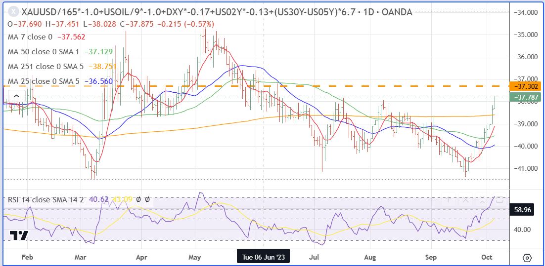
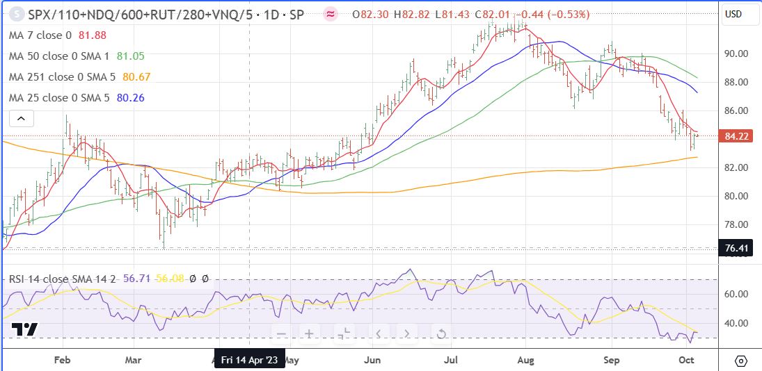
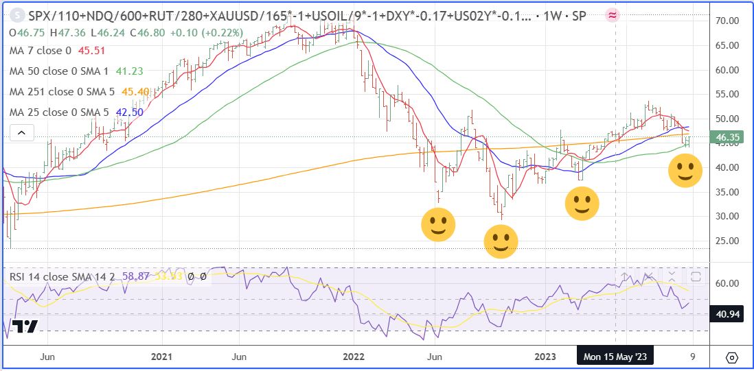
First we will take a look at the trio of charts that I use to show me the overall picture. These are the Economic Restrictions, Economic Demand, and the combination of those two charts, the Net Economic Demand Chart.
What we see is that the driving force in the current phase of the cycle is the rolling over of economic restrictions, like gold prices, oil prices, the dollar, and most importantly the end of interest rate yield inversion and the end of FED FUND rate increases. It is true that gold, oil and the dollar are volatile elements and we probably are close to seeing a sharp decline in the dollar to the mid 70’s and a rise in gold, while the interest rate picture is decidedly front and center.
Here is the Economic Restriction Index Chart updated this morning. It is apparent that the restrictions have declined since Fed Day, September 20. (index is calculated using negative numbers, ie a decline in restrictions raises the index).
The next chart is the Economic Demand Index chart. The picture it presents is demand under pressure, which really is an indication of less speculative involvement and bigger potential going forward.
And to put it all together, here is the Net Demand Index which to better show the macro view I use weekly data and use smiling faces at each turning point in this “Green Rally”.
Leave a Reply