Time to start monitoring and calculating Again
For the past montb, since April 27, the Debt Ceiling conversation has dominated any conversation about the economy and by extension, the markets.
While the final Ceiling votes are not in yet, the deliberations are nearing an end. During this deliberation time the economy has, as we have characterized it, kept chugging along with GDP forecasts for the second quarter coming in with a range of 1.9 to 2.9 % growth.
Recession talk has been a dominating back channel theme. All the big name investors and economists are unanimous in that prognostication.
And then out of seemingly left field we see one of the four Climate Tech sectors, the core building block, chips, take over the markets with the NVDA company stock. AI then is seen as the driver, but to me, it is only one driver of the Chip sector, there is so much more going on.
With all that said I will be watching closely what I call our Economic Visualization Model (realized it needed a name that tells the story). It is expressed in a chart that we have provided a number of times before as we were watching the unravelling of the economy in early 2021. This model puts together a number of pieces of the economy, some viewed as reflections, some providing feedback loops, either positive or negative depending on their values. All numbers in the model are normalized and weighted based on our estimates of significance.
The factors that are refelctions are:
- S&P Price (higher prices push model higher, lower prices push model lower).
- Nasdaq 100 Price (higher prices push model higher, lower prices push model lower).
- Russell 2000 Price (higher prices push model higher, lower prices push model lower).
The Factors that are used as causative inputs are:
- Gold price (higher prices are a negative, lower prices are a positive).
- Oil price (higher prices are a negative, lower prices are a positive).
- Dollar price (higher prices are a negative, lower prices are a positive).
- US02Y interest rate (higher rates are a negative, lower rates are a positive).
- Real Estate ETF price (higher prices are a positive, lower prices are a negative).
- US 30-05 Yield Curve (higher curve is a positive, lower curve is a negative).
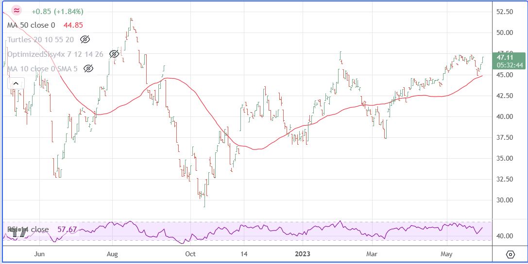
Two levels of the Economic Visualization Model are provided here, one based on Weekly numbers and one based on Daily numbers, both updated through 9:30 AM CDT 05-30-23.
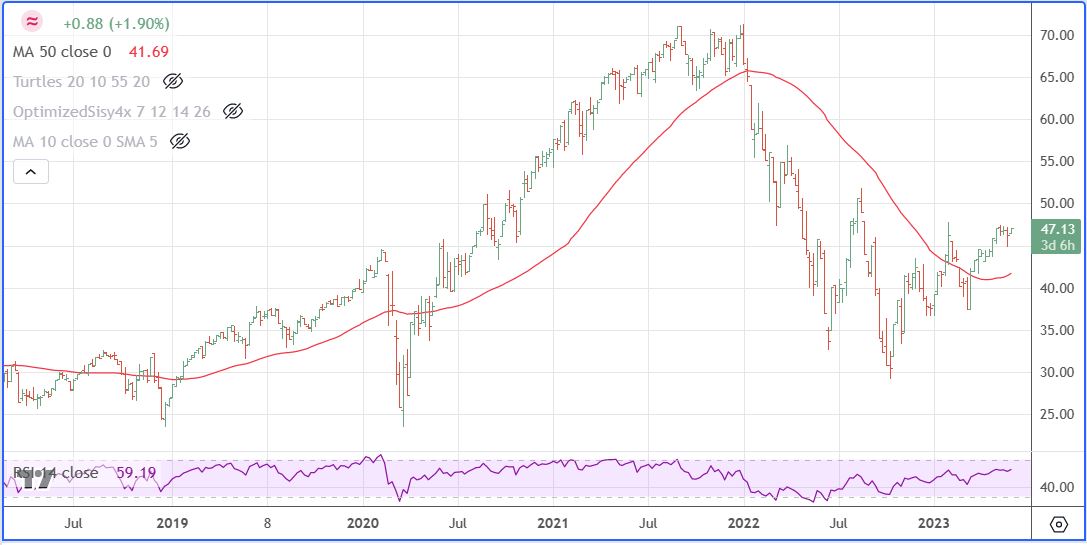
The Weekly based presentation shows the key levels that are in play.
- Week of January 10, 2022 when model levels broke down through 50 day average.
- Week of June 13, 2022 when model levels made initial bottom at 32.65.
- Week of August 15, 2022 when model levels topped at 51.90, that level still stands as one that must be breeched on a weekly closing basis before I would say a new bull leg is engaged.
- Week of October 10, 2022 when model made a new bear market low at 29.40, taking out June 13, 2022 low 0f 32.65.
- Week of January 23, 2023 when model made a first attempt at testing August 15, 2022 level, (reached 47.91, well short of needed 51.90 level).
- Week of March 6, 2023 when model made a test of October 10, 2022 low based around banking issues (declined to 37.54, well above 29.40 October 2022 level.
- Now in the current period these two levels stand out: A) January 23, 2023 High of 47.91 and August 15, 2022 High of 51.90. Today’s early high is 47.45 and currently we are sitting at 47.13, up 1.88 % for the day.
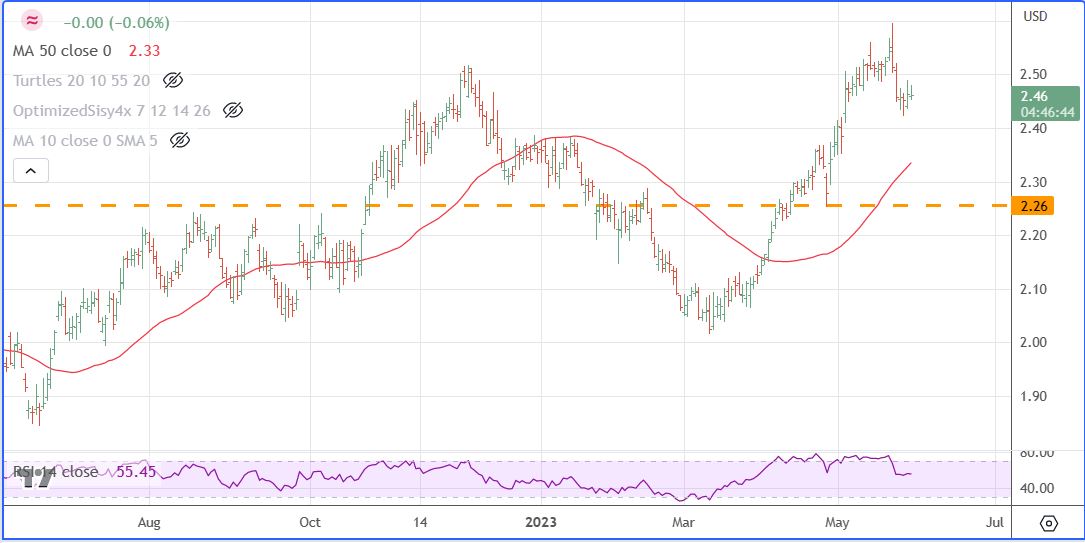
And one more thing to put this moment in time in its place, what I call my Canary Index, based on two of what I will call deep sentiment stocks that over time have shown the way, many times well ahead of the market, of market direction. This Canary Index made a new all time high on December 1, 2022 at 2.51, took out that high and made a new high at 2.59 on May 12, 2023, and as of today is sitting at 2.46. See chart below, so we are not out of the woods and free and clear yet.
Leave a Reply