One Chart to Watch
All this talk on yield curve inversion pointing towards a recession.
How real is it?
In reality, the inversion is basically due to the FED wanting to get the Fed Funds rate to 3 percent, probably a good place to hit and sit out this inflation wave.
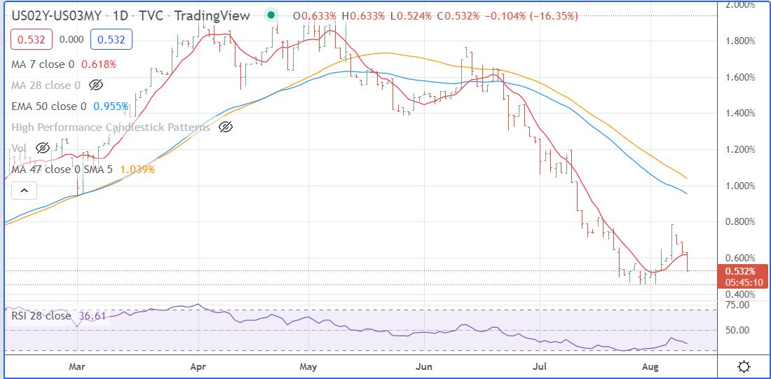
Last Friday’s employment report added a new wrinkle, the economy is stronger than the Bears forecast. So, I am watching the bar chart at the core of this analysis, the yield curve between the 2 year and the 3 month rates. You can see that the 2 year rate jumped up versus the 3 month rate on Friday’s employment number, ending a decline that started on June 16. Now I am watching to see when this chart takes out Friday’s high on a closing basis. That will tell us when the FED Fund rate hike is over
Here is the chart:
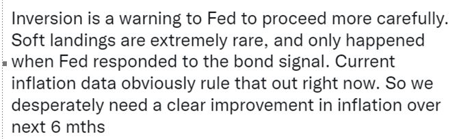
And here is a comment I saw today on Bloomberg.
Leave a Reply