The Analysis Theme
Continuing on with what I said a few days ago. For the last 16 months analysis has appeared to have no value, the Fed was willing to continue the “NO Consequences Economy”. What I mean here is that negative actions by people and corporations were offset by cheap interest rates and more funny money. Don’t get vaccinated and go on welfare, no problem, Corporations with no backup reserves or running on toxic leverage, no problem, we will bail you out. At some point there will be a price to be paid and it will affect asset prices. My aim is to watch for that eventuality and watch Washington, keeping in mind that little is ever done that increases productivity, the Republicans give no strings money to corporations and agriculture interests, while Democrats give no strings money to the bottom 70 % of the population.
So keeping all that in mind:
- I think the first thing to watch is for embedded inflation, inflation created by both raw material prices and lower worker productivity per dollar of wages.
- The second thing to watch for is a declining consumer outlook. Government has provided a lot of emergency funding to fill income holes but that is all ending. Added to this is a dark scenario for work from home workers who are now being forced to go back to the place of employment. They are not happy. Plus we have the disinformation bubble that has generated a population subset that is gobbling up bad and wrong ideas.
So in this next phase of the economic picture we first will be watching the consumer demand picture (I have heard a third of GDP over the past year has been government hand outs and that is going to change. Even if the infrastructure bill passes, that is only like 500 billion per year over the next ten years).
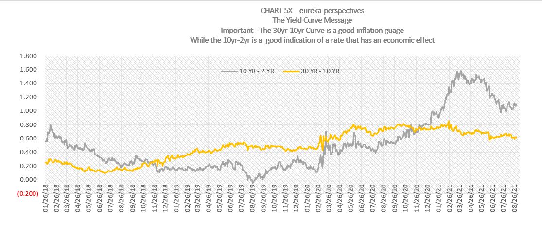
And then the effect of the FED and the debt picture come into focus. For that part of the analysis the ten year bond and the 10-02 year yield curve are the focus. For the the ten year is what runs the economy, while the 10-30 year curve is really an inflation picture which everyone talks about but other than pension fund managers, ignores.
Here are some charts for that picture that we follow:
The first chart show two yield curves, the first measures what I would call the economic working rate, the 10 yr rate vs the 2 yr rate, the second measures the inflation response, the 30 yr rate vs the 10 yr rate. As you can see the inflation response has been muted probably due to all the 20 and 30 yr bonds the FED has been buying. We will be watching closely when the FED really tapers.

So keep on looking at the bubble, the picture is getting clearer as the limits are stretched.
Leave a Reply