What Kind of Recovery are we Having ?
This from Bloomberg News this morning:
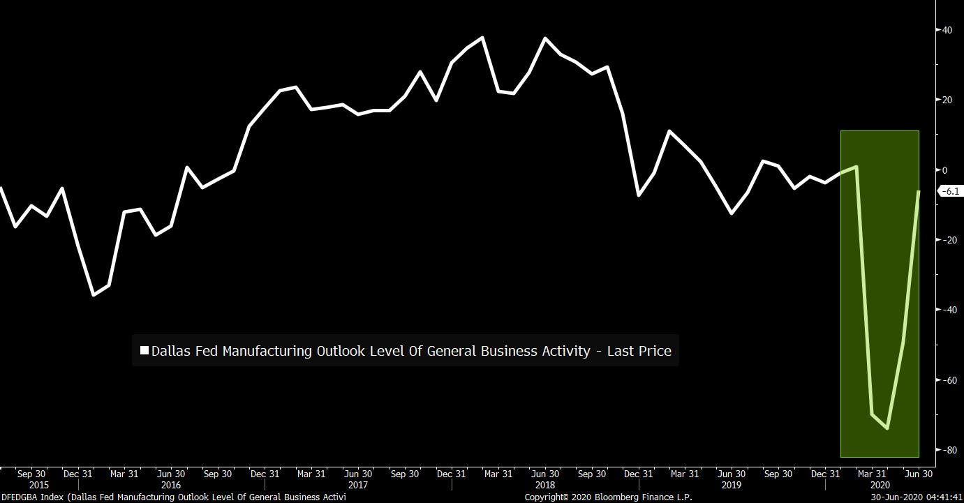
By this point, you’re probably tired of hearing the economy described in alphabet shapes. V-shaped, U-shaped, K-shaped etc. Nonetheless, it’s worth pointing out how easy it is to be deceived by certain types of data, especially manufacturing surveys, into thinking the recovery is more robust than it is. Yesterday we got the Dallas Fed Manufacturing index, and the general shape of it certainly looks pretty V-ish. It’s almost back to where it was pre-crisis.

But it turns out this isn’t a V at all. The key reason is that these regional Fed surveys, or PMIs, or ISMs (they’re all similar) aren’t measuring some absolute level of activity. They’re measuring how the panelists’ businesses are doing relative to the month before. So you’ll notice that the Dallas Fed chart above shows a reading of -6.1. Because it’s below 0 that means respondents on net actually said business was worse than it was in the prior month.
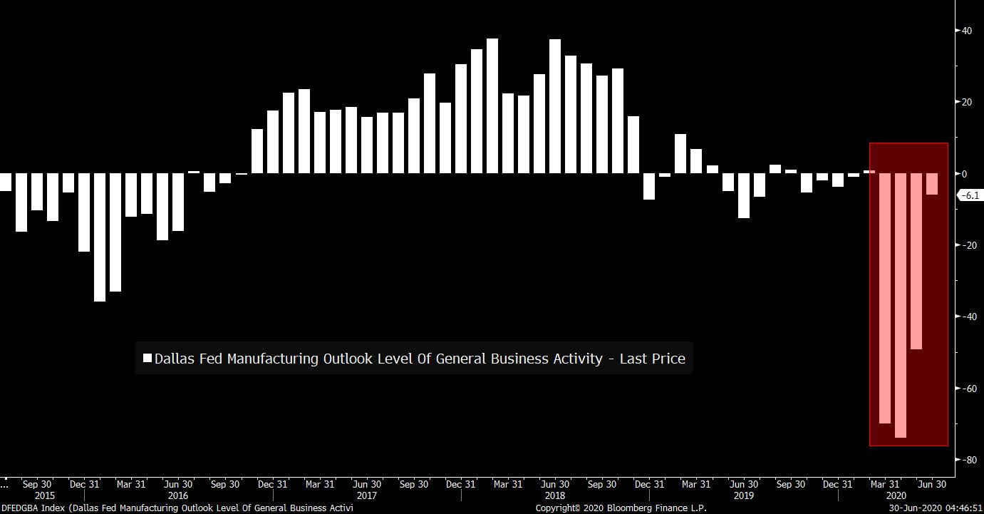
Here’s the same data as above, but presented as a bar chart, which makes the situation even more clear. As you can see, manufacturers in Texas have now reported four straight months of the situation being worse than it was in the month before. Yes, the pace at which it’s getting worse is less severe, but it’s still a sequential deterioration.

Anyway, all you have to do is take one look at
the actual survey,
and you’ll see there’s no V. The employment situation is getting worse. More
manufacturers are still laying off workers than expanding payrolls. Only 29% of
survey respondents see a better economic future than they saw the previous
month. Business uncertainty is still growing. And if you read
the anecdotal comments, there’s already some talk from companies
about how the latest rise in Texas virus cases is an economic concern. Bottom
line: there are a lot of charts that look like a V, but in reality they
don’t show anything close to a snapback to normal.
Leave a Reply