What Changed on July 4th 2014 ? Are we Seeing the Return of a Free Market ?
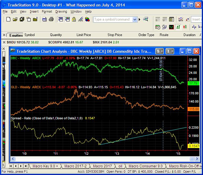
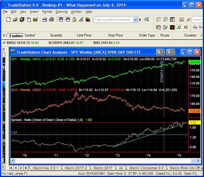
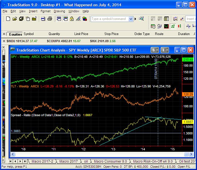
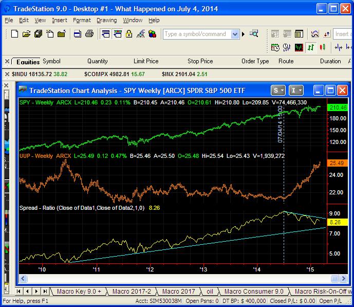
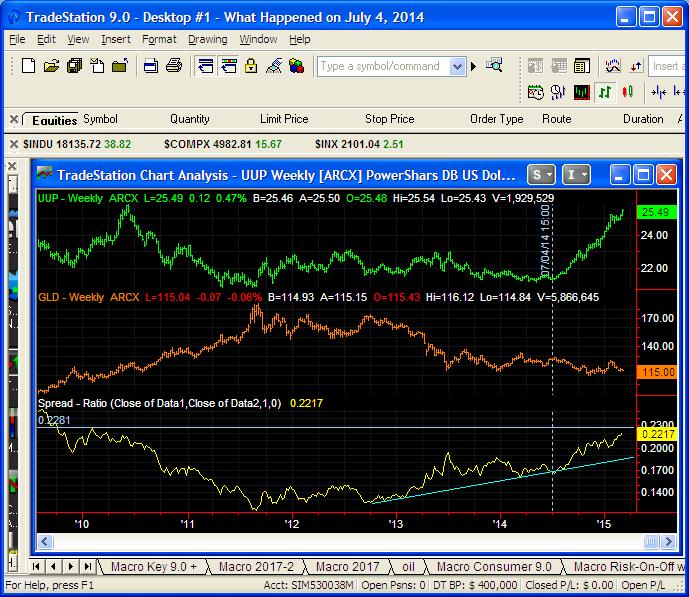
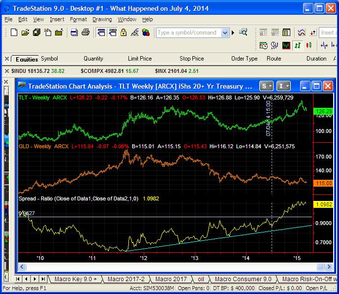
We are going to show a series of six charts today that illustrate some relationships that have evolved over the past five years, in particular the past 9 months. Some are probably causes, some are probably effects, but in total they are food for thought as the FED tries to deal with unwinding an unprecedented heavy hand. All data series are ETF based. The vertical white line is July 4, 2014. Charts were made before the employment report last Thursday although no overall change in relationships has happened since.
The first chart is Commodities (includes oil) vs. Gold. The value of the dollar is affecting everything and is a reason that the oil market bulls will probably have a long haul.
The second chart is the S&P vs Gold. Stocks would appear to not be affected by the direction to deflation so far.
The third chart is the S&P vs. T-Bonds and here in the relationship chart you do see the effect of deflation as the S&P has declined against Bond values since July 2014.
Here you see some underlying relationships as the S&P relationship shows how stock market momentum is being affected by the dollar.
Here you see the classic Dollar vs. Gold with the acceleration of the Dollar over the past 9 months.
Here you see the predominate trend toward deflation exhibited by T-Bond values vs. Gold.
Leave a Reply